Your Cart is Empty
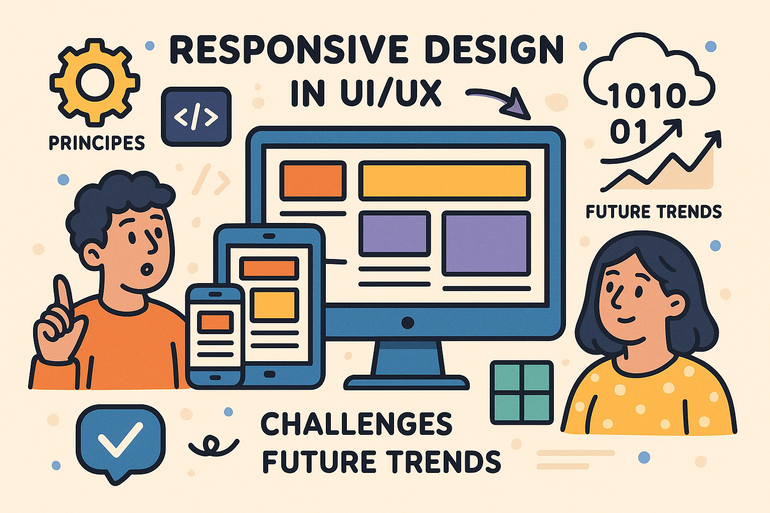
Responsive Design in UI/UX: Principles, Challenges, and Future Trends


Background and Importance of Responsive Design in UI/UX Software
Overview of Responsive Design Principles
Responsive design stands as a fundamental basis for today’s UI/UX software, dynamically adapting layouts, images, and interfaces to meet a broad spectrum of device resolutions and screen sizes. In this context, the concept of responsive design is built upon several core principles that include fluid grids, scalable images, and flexible media queries. These approaches allow developers and designers to ensure consistent user experiences regardless of whether the user accesses software on a desktop, tablet, or smartphone. The importance of designing with adaptability in mind is underscored by the dramatic increase in usage of mobile devices over the last decade, and by the growing expectation for instantaneous responsiveness and ease of interaction. Throughout the evolution of modern technology, these principles have evolved to incorporate not only visual flexibility, but also interactive and performance optimizations that contribute to seamless experiences.
Emphasizing the role of **user-centric design** and **device agnosticism**, the modern approach to responsive design incorporates multiple strategies. Key features include the implementation of fluid grid systems that automatically resize and realign visual components and media queries that distinctly adjust elements based on screen parameters. Moreover, responsive design is further enhanced by techniques involving ephemeral animations, interactive feedback, and transitions which help maintain a consistent narrative throughout the application interface. In addition to technical elements, comprehensive design strategies now integrate human factors such as cognitive load and accessibility, ensuring that responsiveness is not merely a visual convenience but a pillar of overall user satisfaction and engagement. The adaptive nature of these solutions ensures design resilience even as user expectations and technological capabilities continuously evolve.
Evolution of UI/UX Software and Its Impact on User Satisfaction
The evolution of UI/UX software has been marked by a continuous quest towards greater sophistication and responsiveness. As digital experiences transitioned from static, screen-bound applications to dynamic, cloud-based platforms, there came a markedly increased demand for adaptable interfaces that responded intuitively to user actions. Early design paradigms were rigid and deterministic; however, the advent of modern frameworks has allowed for a flexible approach to interface development that embraces complexity and diverse user behavioral patterns. An important factor has been the integration of **adaptive components** and **design tokens**, which work collectively to ensure that software interfaces are not only visually appealing but also functionally reliable across a vast array of devices and use cases.
Several characteristics have contributed to this transformation, including the use of flexible grid systems, media query frameworks, and dynamic component libraries. These attributes are crucial not only for the technical application of a responsive layout but also for the psychological assurance they provide users, who increasingly expect polished and efficient interactions regardless of the device utilized. Furthermore, software companies continuously refine their product development cycles to incorporate real-time analytics and user feedback, thereby ensuring that design adaptations are grounded in actual usage scenarios. The combination of technological advancements and deep insights into user behavior has propelled responsive design from a novel concept to a critical component in achieving high levels of customer satisfaction and consistent digital performance in an ever-changing marketplace.
Core Features and Implementation Strategies
Fundamental Responsive Design Features
Modern UI/UX software leverages a multitude of core features which collectively empower developers to create adaptive and responsive interfaces. Fundamental to this process are flexible grids that underpin the layout structure, ensuring that content scales fluidly across diverse screen sizes. Alongside flexible grids, the strategic use of **media queries** allows software interfaces to modify their appearance dynamically based on specific device characteristics such as width, height, orientation, and resolution. Additionally, the integration of adaptive components facilitates a modular design approach where user interface elements are constructed to adjust their size, position, and behavior in concert with overall layout changes. This suite of features has become indispensable for delivering multi-device compatibility and ensuring that digital content remains legible, navigable, and aesthetically consistent under varying conditions.
To better illustrate these concepts, consider a typical workflow often encountered by professionals in the design space:
- Flexible Grids: These grids use relative units rather than fixed pixels, promoting scalability.
- Media Queries: Conditional CSS rules that activate based on the screen properties of the device.
- Adaptive Components: Modular building blocks that reorganize in response to environmental parameters.
Integrating Design Tokens, Style Guides, and Practical Strategies
Integrating **design tokens** and comprehensive style guides into UI/UX projects is a significant strategy that bolsters consistency across multiple platforms. Design tokens encapsulate the visual identity and semantic meaning of a brand’s design language, ensuring that elements such as colors, typography, and spacing are standardized. This standardized repository acts as a precious resource for developers and designers alike, reinforcing a harmonious user experience regardless of the rendering environment. When combined with a carefully constructed style guide, design tokens serve to facilitate the rapid development of adaptive interfaces and provide a blueprint for maintaining a consistent visual narrative, even as the underlying structure adapts based on device context.
In the practical implementation of these strategies, teams often adopt an iterative methodology that involves:
- Developing a centralized token library: A single source of truth for design properties.
- Creating exhaustive style guides: Detailed documentation of UI components and behaviors.
- Implementing responsive frameworks: Utilizing code frameworks that support iterative and adaptive design techniques.
Overcoming Challenges in Responsive UI/UX Implementation
Performance and Cross-Device Compatibility Challenges
Implementing responsive UI/UX solutions presents a variety of practical challenges, with performance optimization and cross-device compatibility among the most pressing concerns. As software projects scale in complexity and reach, ensuring that every interface not only displays correctly but performs seamlessly across a wide range of devices becomes increasingly difficult. Issues such as varied network speeds, processing power limitations, and differing support for modern CSS and JavaScript features across browsers can hinder the intended responsiveness. To combat these challenges, professionals in the field have developed a range of techniques and best practices that include meticulous code optimization, efficient resource management, and rigorous testing frameworks. Adopting a performance-first mindset, designers must balance the needs for aesthetically pleasing interfaces with lean code execution, ensuring that every component contributes positively to the overall system performance.
Key strategies in addressing these issues include:
- Optimized asset loading: Techniques such as lazy loading, image compression, and script minimization are critical.
- Cross-browser compatibility testing: Systematic validation across different device simulators and real devices to identify discrepancies.
- Adaptive resource management: Dynamically adjusting assets based on device capabilities and network conditions.
Testing, Validation, and Team Collaboration Best Practices
Addressing the multi-dimensional challenges inherent in responsive UI/UX development necessitates a rigorous approach to testing and validation. The process of evaluating a responsive design involves not only traditional usability tests but also specialized cross-device and cross-platform assessments. Automated testing tools, in conjunction with manual exploratory evaluations, have become instrumental in detecting issues that may arise from the varying performance profiles of devices. Equally important is the sustained collaboration between design and development teams, which is crucial for resolving ambiguities and ensuring that implemented solutions meet the holistic vision of a project. The application of a collaborative framework reinforces accountability and accelerates the feedback loop, paving the way for iterative improvements that refine both functionality and user experience.
This process typically involves:
- End-to-end testing: Incorporating both automated and manual procedures to uncover inconsistencies.
- Real-device simulation: Utilizing device labs or cloud-based simulators to assess the performance in real-world contexts.
- Interdisciplinary collaboration: Regular meetings and integrated workflows that align the priorities of design and engineering teams.
Future Trends and Advanced Responsive Design Techniques
Emerging Technologies and Their Influence
As we look ahead to the future of responsive design within UI/UX software, emerging technologies such as **AI-driven personalization** and real-time adaptive interfaces are poised to drive substantial change. These advanced techniques are reshaping how interfaces interact with users by incorporating automated decision-making processes that tailor user experiences based on behavior, contextual cues, and predictive analytics. AI-driven tools analyze vast amounts of user data to optimize layouts, recommend content, and adjust interactive elements on the fly, ensuring that designs are not only visually responsive but also contextually relevant. The integration of such technologies enables a more granular approach to design adaptation, where interfaces evolve continuously to better meet user expectations, thereby setting new benchmarks for performance and user engagement.
Prominent factors influencing these emerging trends include:
- Real-time analytics: Offering dynamic insights into user behavior, which inform interface modifications.
- Adaptive machine learning algorithms: Personalizing the user interface based on historical and real-time data.
- Sensor-based input and data: Incorporating environmental factors and user context to anticipate and meet needs.
Adaptation to New Devices and Interaction Modalities
The rapid proliferation of new devices and interaction modalities continues to redefine the landscape of responsive UI/UX development. With the introduction of wearable technology, foldable displays, and voice-activated interfaces, designers are compelled to reimagine traditional approaches and incorporate multi-modal interaction patterns. The shift towards more immersive and sensor-rich environments has necessitated an expanded design toolkit that can accommodate non-linear navigation and context-driven usage scenarios. As emerging technologies like augmented reality and mixed reality begin to converge with conventional responsive elements, designers are tasked with harmonizing disparate input methods into a cohesive experience that remains intuitive and accessible across all platforms.
To effectively address these challenges, modern UI/UX strategies often include:
- Multi-platform development: Establishing architectures that offer native and web-based solutions to suit various device types.
- Innovative interaction patterns: Incorporating gestures, voice commands, and sensor data to enrich the user experience.
- Iterative design testing: Continuously validating across a growing ecosystem of devices to ensure seamless adaptation.
Conclusion
Recap and Key Strategies
In summary, the role of responsive design in modern UI/UX software cannot be overstated. Throughout this discussion, we have explored how responsive design principles have evolved from early static layouts to highly adaptive frameworks that prioritize both functionality and visual appeal. The integration of flexible grids, media queries, adaptive components, and design tokens stands as a testament to the dynamic nature of contemporary design thinking. These **key strategies** empower designers and developers to deliver intuitive, consistent, and satisfying user experiences across a myriad of devices. By emphasizing a user-centric approach and leveraging advanced computational methods, early responsive designs have matured into robust systems that balance aesthetic elegance with technical reliability.
The practical strategies covered, from performance optimization and cross-device compatibility testing to fostering interdisciplinary collaboration, underscore the intricate relationship between design methodologies and emerging technologies. As the digital landscape continues to evolve, the need for innovative, adaptable design solutions grows ever more critical. Maintaining such high standards and continuously refining these best practices will remain central to the future development of responsive UI/UX software.
Encouragement for Innovation and Future Outlook
Looking ahead, the future of responsive design promises a transformative melding of advanced technologies with creative design traditions. As emerging trends such as **AI-driven personalization**, augmented reality interfaces, and immersive sensor-based interactions gain prominence, design professionals are encouraged to explore novel methodologies that push the boundaries of traditional interaction paradigms. The convergence of disparate technologies presents an opportunity to craft digital experiences that are not only aesthetically compelling but also deeply intuitive and contextually aware. By embracing these advancements, designers and developers can create interfaces that dynamically adapt and evolve in real-time to meet diverse user expectations.
The path forward involves continuous experimentation, iterative development, and a commitment to maintaining rigorous quality standards through automated testing and cross-disciplinary collaboration. It is essential for professionals in the field to remain open to innovation while also honoring the foundational principles that have made responsive design a cornerstone of modern user experience. With this balanced approach, the next generation of adaptable design solutions will not only enhance usability but will also inspire new levels of creative expression and technological sophistication. This forward-looking outlook underscores the importance of investing in research, education, and collaborative development to ensure that responsive design continues to evolve in tandem with the rapid pace of technological advancement.
Also in Design News