Your Cart is Empty
Bluebeam Revu UI Standardization: Role-Based Profiles, Tool Chest Rules, and Markups List Metadata for Faster QA/QC
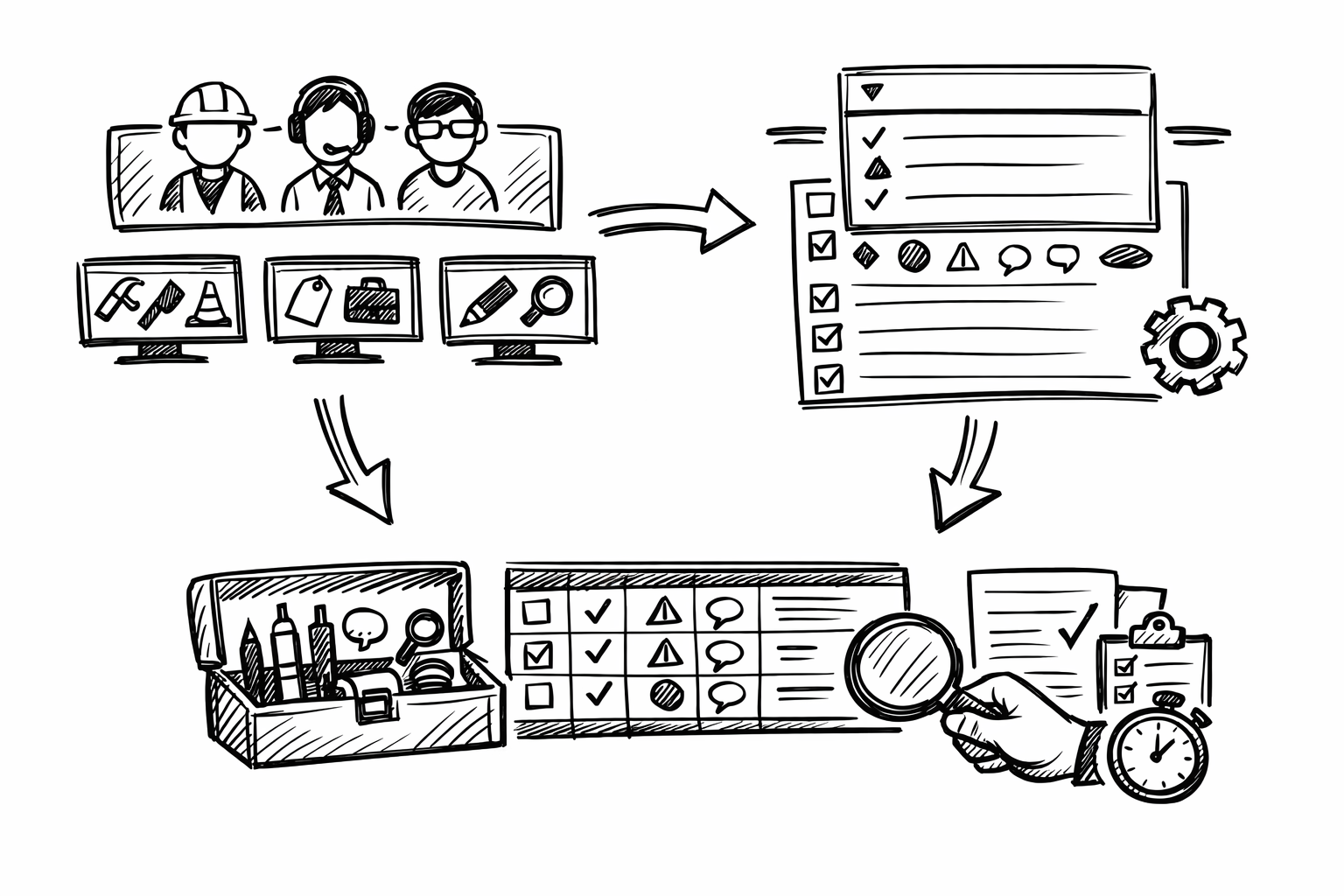


Bluebeam Revu becomes dramatically faster and more consistent when its interface is treated as an engineered environment rather than a personal preference. The goal is to reduce friction and increase consistency by tailoring profiles, tool sets, panels, statuses, and shortcuts to specific disciplines and tasks (AEC, structural, MEP, civil, CA). In this context, “custom profile & interface tweaks” means changes that can be exported and shared, enforced across teams, and repeated across projects so QA/QC is predictable and markups are produced quickly with minimal variance.
Role-Based Profiles that Control the Entire UI (Panels, Toolbars, Navigation, Display)
A Bluebeam profile is the closest thing Revu has to an “operating mode.” It governs what you see, where it lives on screen, and which tools are immediately accessible. When profiles are role-based, they prevent the slow drift into a cluttered, inconsistent UI that undermines review quality and makes cross-team collaboration harder than it needs to be.
What to customize
Start by building a profile per discipline and per recurring task. The practical intent is to make the UI match the mental checklist of that workflow, so reviewers are not hunting for panels or using the wrong markup styles under deadline pressure.
- Create a Profile per discipline + task, such as:
- Architect – SD Review
- Structural – RFI Response
- MEP – As-Built Walkdown
- Civil – Site Plan Redlines
- PM – QA/QC
- Lock down the panel layout so the same information is always visible in the same place:
- Properties
- Markups List
- Layers
- Tool Chest
- Measurements
- Tailor toolbars to “only what you use” in that role:
- Measure tools, Sketch-to-Scale, Text, Cloud, Callout
- Punch tools if field-driven
- Compare, Overlay for design evolution
- Optimize View behaviors per workflow:
- Thumbnails versus Page Layout navigation based on sheet count and discipline habits
- Single Page versus Continuous depending on whether you are scanning sheets or deep-reading details
- Revu “Reuse” of last tool settings to support repetitive markup patterns
- Snapping behavior (critical for measurement reliability)
- Rendering mode and visual clarity settings for large PDFs and dense linework
In practice, the most impactful decision is to treat panels and toolbars as “production infrastructure.” If every structural reviewer has Properties and Measurements pinned, and every CA reviewer has Markups List and Status controls visible, you reduce training variability and create reliable output in the markups database.
Discipline-specific patterns
A profile is most effective when it encodes the common rhythm of a discipline’s review session.
Architectural design review tends to be comparison-heavy: sheets evolve rapidly and reviewers spend more time validating change intent and graphical consistency than measuring. Prioritize Compare/Overlay access, Spaces and Layers visibility, and strong visual clarity controls (line weight perception, rendering settings) so design deltas are obvious without zoom gymnastics. Keeping Thumbnails readily available also helps when moving rapidly between plan, RCP, and enlarged plans.
Structural review is often measurement- and detail-driven, with an emphasis on calibrated scale checks, clear callouts, and consistent markup appearance so comments are unambiguous in the field. Keep calibrated measurement tools front and center, ensure snapping is predictable, and pin Properties so you can adjust line styles, dash patterns, opacity, and arrow/leader behavior rapidly without breaking standardization. A small but high-leverage choice is to keep the Markups List visible enough to confirm each structural comment received the correct subject/status before you move on.
MEP coordination reviews behave more like trade separation and issue routing. Layers and Legends become central, and custom statuses plus quick filters are essential for keeping ownership clear. The profile should lean into rapid filtering, layer toggling, and consistent tagging so issues can be triaged by trade, zone, and disposition path without rework.
Team standardization
Once the profile is stable, treat it like a versioned deliverable. Export and import profiles across offices so the same workflow produces the same UI and the same markup behavior. Establish a naming convention that makes versions obvious and reduces accidental use of outdated setups, for example MEP_Coord_v3.2 or Struct_QC_v2.0. When multiple offices collaborate, this naming discipline avoids “it looks different on my screen” friction and creates repeatable QA/QC conditions.
Tool Chest Overhaul: Custom Tool Sets + Properties Mode for Consistent Markups
The Tool Chest is where consistency either becomes automatic or remains aspirational. A well-built tool set prevents the two common failures of PDF reviews: reviewers inventing new styles midstream and reviewers over-customizing each markup until it no longer matches team convention. The target state is that a markup’s appearance and metadata are correct by default.
What to customize
Build discipline tool sets grouped by intent rather than by markup type. This aligns the Tool Chest with how people think during reviews: “Is this a code issue?” “Is this constructability?” “Is this QA/QC noncompliance?” Then enable Properties Mode so each saved tool carries its standardized settings whenever it is used.
- Create tool sets focused on recurring review intent:
- QA/QC (noncompliance, missing info, clashes)
- Constructability (clearance, access, sequencing)
- Code (egress, fire rating, ADA)
- Field (punch, as-built notes, photo placeholders)
- Rely on Properties Mode to enforce standardization:
- Line weight, color, opacity, and fill behave the same across users
- Text font, size, leader styles, and callout shapes remain consistent
- Establish consistent appearance rules:
- Color/weight by discipline so markup intent is visually legible at a glance
- Opacity conventions for overlays so underlying design remains readable
- Standardized fonts and leader styles to reduce ambiguity in printed exports
Standardization is not just about aesthetics; it is about interpretability. When opacity, leader style, and text size are predictable, issue density can increase without becoming illegible, which is crucial in late-stage coordination or field redlines.
High-leverage tool set content
Tool sets should include “pre-decided” communication patterns, not just shapes. A few well-crafted tools typically deliver most of the productivity gain.
Callouts with prefilled prefixes reduce cognitive load and create searchable consistency in the Markups List. Saving callouts such as “RFI:”, “ASI:”, and “REV:” in the tool name and/or subject line encourages reviewers to write issue statements that align with downstream workflows.
Clouds are another silent productivity sink when every user chooses different line weights, corner radii, and colors. A standardized cloud tool set should include variants for severity (for example, “Minor Clarification” versus “Critical Coordination”) while still conforming to a disciplined palette.
Dimensions deserve separate standardization because architectural and engineering conventions often differ. Define dimension styles that encode units, precision, and scale assumptions so measurements are reliable and immediately interpretable:
- Architectural dimensions:
- Feet-inches formatting
- Precision aligned with typical architectural tolerance
- Scale presets aligned to common plan scales
- Engineering dimensions:
- Decimal units
- Higher precision where appropriate
- Scale and calibration expectations clearly encoded in the workflow
Count tools are often underused in design reviews but become extremely valuable once configured to match discipline metrics. Save count tools for fixtures, penetrations, devices, and even symbolic items like weld symbols where the review requires rapid quantification or verification. The benefit is twofold: consistent counting behavior and a clean export path into summaries.
Governance and portability
Tool sets should be treated as shared assets with controlled change. Store them in a shared location, restrict edits to designated owners, and publish updates on a defined cadence. This prevents “tool drift” where one office uses last quarter’s callout style and another office uses an improvised variant that breaks reporting consistency.
One practical governance technique is to embed micro-instructions in tool names, such as “CLASH – tag both sheets” or “RFI – include gridline + elevation.” These are small nudges that raise the baseline quality of comments without adding training sessions or review overhead.
Markups List as a Discipline Database: Custom Columns, Statuses, Filters, and Actions
Most teams still treat markups as graphics on a PDF. Revu’s Markups List, configured properly, functions more like a lightweight issue database: structured, filterable, and exportable. When disciplines adopt a shared metadata vocabulary, coordination becomes measurably faster because sorting, triage, and closeout stop relying on manual scanning.
What to customize
Begin with statuses that mirror how work actually moves through your organization. Statuses are not decoration; they are the operational state of an issue. A good set supports triage, assignment, backcheck, and closure without requiring separate spreadsheets.
Examples that map well to real workflows include: Open, In Review, Backcheck, Accepted, Rejected, For RFI, For ASI, and Needs Field Verify. The exact labels matter less than consistency and meaning.
Next, add custom columns to capture the metadata you routinely wish you had when summarizing comments, coordinating across trades, or generating closeout reports. Useful columns often include:
- Discipline
- Spec Section
- Location/Space
- Priority
- Responsible Party
- Cost Impact
- Schedule Impact
- Drawing Revision
After statuses and columns, build saved filters. Saved filters turn the Markups List from a long scroll into a control surface. Filters that commonly deliver immediate value include:
- By sheet and by sheet set (for staged review cycles)
- By status (Open versus Backcheck versus Accepted)
- By assignee or responsible party
- By priority (critical path issues separated from minor clarifications)
- By room/space for architectural and CA workflows
- By trade layer or discipline tag for MEP coordination
Discipline-specific use cases
CA/field punch workflows benefit from status-driven closeout tracking. When each punch item has an assignee, due date, and location/space, closeout becomes a controlled process rather than a series of email threads. Exports to CSV or PDF summaries become consistent weekly deliverables rather than last-minute manual work.
Engineering QC typically needs rapid isolation of high-risk items. If structural reviewers can filter “Priority = High” and “Discipline = Structural,” then backcheck cycles become much tighter. It also becomes easier to validate that every significant issue has a disposition before issuing comments to the broader team.
MEP coordination often hinges on determining ownership and resolution path quickly: whether the item belongs to a trade, the GC, or the design team. A disciplined use of Responsible Party plus a coordination-specific status (for example “Trade Routing” versus “Design Clarification”) reduces churn and prevents the same issue from being logged multiple times by different reviewers.
Automation and repeatability
Revu can accelerate high-volume workflows with batch actions: applying a status to many markups after a meeting decision, using standard replies for common dispositions, and updating metadata fields consistently across a group of comments. The goal is to reduce the number of times a reviewer must touch the same issue.
Standardize subject lines and prefixes to improve searchability across sessions. If “RFI:” always means the same thing and appears in the same field, you can search across PDFs and exports reliably. This is where Tool Chest prefixes, Markups List columns, and status design reinforce each other as a system rather than as isolated settings.
Context-Aware Workspaces: Saved Panel States + Multi-Monitor Layouts + Task Switching
Even with strong profiles and tool sets, productivity collapses when the workspace is wrong for the task. Reviews oscillate between reading, marking, measuring, and reporting. Saved panel states make these transitions intentional, fast, and repeatable, especially under tight deadlines.
What to customize
Create layouts optimized for distinct review modes. The core idea is to reduce panel noise when you need visual focus and to surface data panels when you need tracking discipline.
-
Redline Focus workspace:
- Large canvas
- Minimal panels
- Fast access to core markup tools
-
Data/Tracking workspace:
- Markups List visible and wide enough to read columns
- Properties panel exposed for controlled styling
- Thumbnails available for rapid sheet navigation
-
Measure/Quant workspace:
- Measurements panel accessible
- Tool Chest prominent for dimension/count tools
- Viewports configured for measurement workflows
Multi-monitor setups are where this becomes transformational. Keep Markups List and Properties on one screen and the sheets full-screen on the other. This preserves drawing real estate while still maintaining strict control of metadata and appearance. For teams that rely heavily on Compare/Overlay, assign those outputs to a dedicated workspace so you can swap between “analysis view” and “comment entry view” without dismantling your UI every time.
Discipline-specific patterns
Architecture benefits from rapid switching between overlay comparisons and markup entry. Reviewers often validate multiple design iterations quickly, then document findings in a structured pass. A workspace that makes Compare/Overlay effortless, followed by a clean redline canvas, reduces context switching fatigue.
Civil/site workflows often involve large-format plans, long alignments, and repeated navigation across extents. Maximizing canvas and keeping navigation controls accessible (Thumbnails, Page Layout, zoom behavior) matters more than having every panel open. The right workspace reduces the “lost on sheet” problem common to long site plans.
Structural reviewers frequently adjust line style and opacity to layer comments without obscuring details. Keeping Properties pinned avoids repeated trips through menus and helps maintain standardized appearance because changes are made deliberately rather than by improvisation.
Operational practices
Define a “default reset” workspace to recover quickly from UI drift during busy cycles. When panels get torn off-screen or a review session leaves the UI in a messy state, a reset workspace is a fast return to baseline without troubleshooting.
Establish a team baseline workspace so training overhead drops. When new staff can sit down at any machine and see the same review mode layouts, you reduce the onboarding time for both Revu mechanics and procedural expectations.
Input Efficiency: Keyboard Shortcuts, Mouse Behavior, and Custom Commands for High-Volume Reviews
Once the UI, tools, and tracking are disciplined, input becomes the limiting factor. High-volume reviews are often decided by how quickly you can switch tools, apply statuses, and navigate issues without breaking focus. The goal is not to create a complex shortcut system; it is to make frequent actions frictionless and rare actions discoverable.
What to customize
Map shortcuts to the actions you perform dozens or hundreds of times per session. Common candidates include switching between core tools (Select, Text, Callout, Cloud, Measure), toggling Snap/Grid/Content/Reuse, jumping to the Markups List, applying statuses, opening Properties, rotating pages, and controlling split view.
Mouse and selection tuning prevents micro-errors that add up. Refine selection handles and markup interaction preferences so you do not accidentally move markups when you meant to pan, and do not accidentally select underlying objects when you meant to edit text. Decide whether single-key accelerators are appropriate for your team: they can be extremely fast for expert users but can also cause accidental tool switches for occasional reviewers. Align this setting to user proficiency within each discipline profile.
Discipline-specific shortcut strategies
QC reviewers should emphasize workflow navigation and database actions: next/previous markup navigation, status changes, and standard replies. When the review is primarily about triage and disposition, the fastest reviewer is the one who can update status and metadata without leaving the drawing context.
Quantity/estimating workflows should prioritize measurement and count switching, calibration access, and precision toggles. Time is often lost in repeatedly adjusting measurement modes and verifying scale assumptions; shortcuts help keep measurement behavior deliberate and consistent.
Field/as-built workflows benefit from rapid photo/punch tools, standardized callouts, and quick page navigation. Reducing friction here matters because field conditions are noisy and time-limited; the interface must support fast capture of intent with minimal typing and minimal searching for the right tool.
Adoption and maintainability
Publish a one-page cheat sheet per discipline profile. The sheet should reflect the actual profile name and version so users can verify they are aligned. Keep it short enough to be used on day one and focused on a small set of shortcuts that deliver meaningful speed.
Review and prune shortcuts quarterly to keep muscle memory consistent. Removing rarely used shortcuts is often more beneficial than adding new ones, because stable input habits reduce errors during deadline reviews. Tie shortcut updates to profile versioning so changes are deliberate, communicated, and reversible.
Key takeaway: shortcuts and mouse tuning only produce sustainable gains when they are aligned with standardized profiles and tool sets; otherwise, individual optimizations amplify inconsistency across the team.
Conclusion
These five tweaks function best as one system: disciplined role-based profiles that shape the UI, standardized Tool Chest libraries enforced by Properties Mode, a Markups List configured as a searchable and exportable issue database, task-aware workspaces that support rapid mode switching, and high-efficiency inputs that remove friction in high-volume reviews. The implementation directive is straightforward: start with one discipline, pilot on one project, then version and roll out the configuration as a shared standard across teams for predictable QA/QC and faster markups.
Also in Design News