Your Cart is Empty
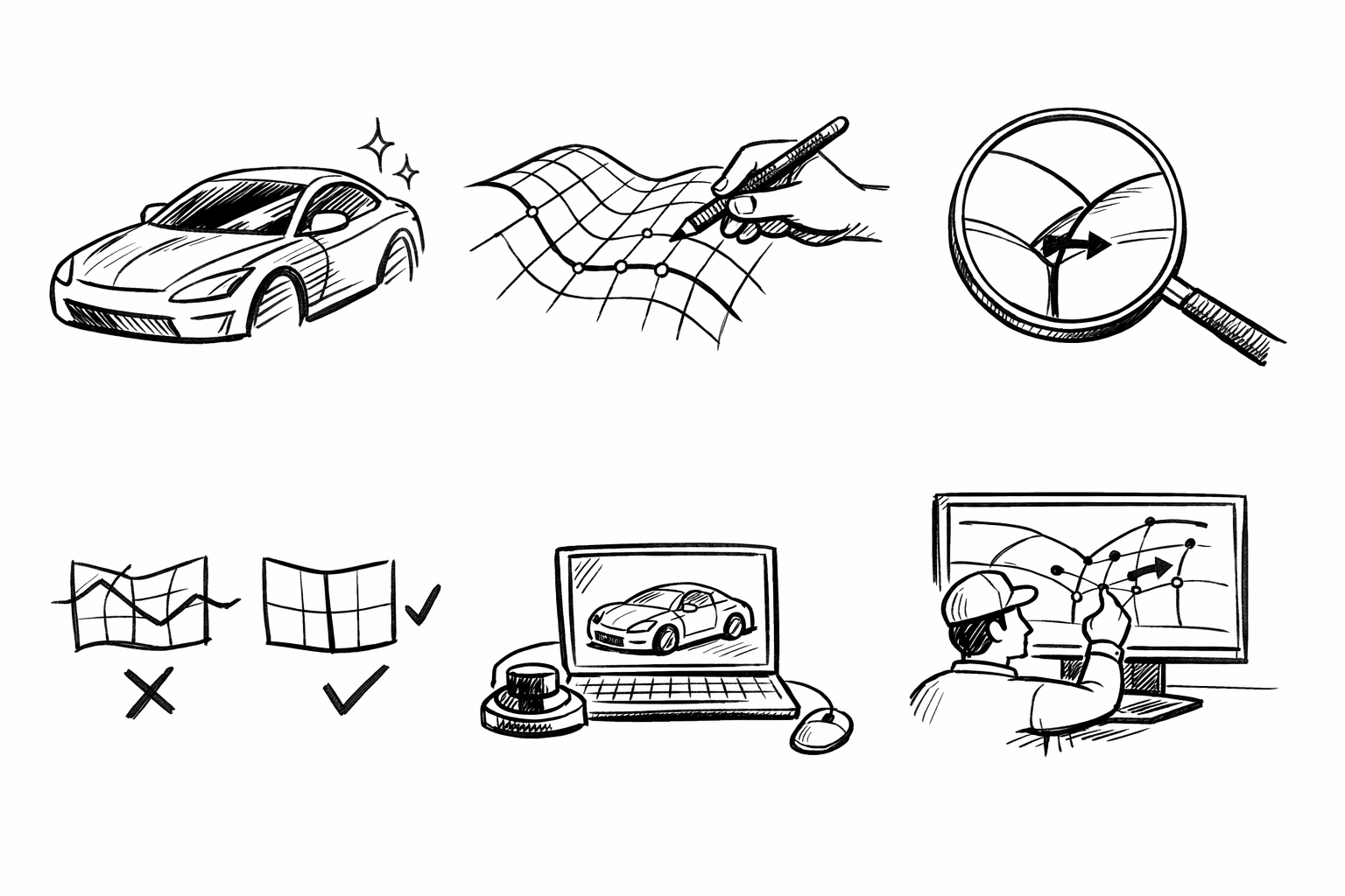
Alias Patch Layout Mastery: 5 Class-A Strategies for Clean Highlights, Stable Edits, and Engineering-Ready Surfaces


A “patch layout strategy” in Alias is the intentional planning of surface boundaries, continuity targets (G0/G1/G2), and editability so the model behaves like a Class-A object rather than a collection of stitched pieces. The goal here is to outline five proven, high-control approaches that work especially well for complex consumer product forms—wearables, small appliances, handheld devices—where reflection quality, manufacturability, and iteration speed must coexist.
Across all five approaches, the same evaluation lenses apply:
- Highlight/reflection line integrity (does the product read “premium” under harsh lighting?)
- Curvature continuity management (G2 where it counts, controlled G1 breaks where functional)
- Downstream readiness (engineering handoff, shelling/parting, draft, trims)
- Edit resilience (change one zone without collapsing the whole model)
Primary Flow First: Build a patch network that follows perceived form flow, not construction convenience
When to use
This approach fits products with a dominant directional “sweep” language—mice, controllers, speakers, bottle-like housings—where the industrial design is read primarily through long reflection bands and ergonomic flow. If your form “wants” to be perceived from front-to-back or top-to-bottom, your patch network should reinforce that perception.
Core layout principles
Start by deciding what the product’s primary reading lines are. Then build the patch network to preserve those lines under edits and rapid detailing. The intent is simple: long, fair surfaces define the object, and secondary patches support them rather than fighting them.
- Establish 2–3 primary longitudinal “spines” that track the strongest reflection flow lines and ergonomic intent.
- Place patch boundaries on or near inflection and flow transition zones to minimize curvature fighting across a seam.
- Prefer fewer, longer patches in the primary direction; subdivide only where additional control is required (features, transitions, localized tension changes).
In practice, this means you should not default to “easiest-to-build” four-sided patches that ignore perceived flow. A patch that is topologically clean but visually misaligned can be worse than a slightly more complex layout that protects reflection behavior. For a wearable shell, for example, the top crown and side wrap often want continuous highlight travel; splitting those zones arbitrarily introduces highlight kinks that are hard to chase later.
Alias tactics
Alias rewards early discipline in curve direction and fairness. A “Primary Flow First” layout is fundamentally a parameterization strategy as much as it is a surface strategy.
- Use curve networks that enforce consistent parameter direction across neighboring patches (U/V alignment). If adjacent surfaces disagree on what “along the flow” means, edits become unpredictable and highlights tend to fracture.
- Keep rails fair early; delay adding detailed cross-sections until the main flow is stable. Over-specifying cross-sections too soon often introduces micro inflections that only show up under zebra or curvature analysis.
- Use analysis early and often:
- Zebra/Light lines to validate flow continuity across spine zones.
- Curvature combs to expose unintended waviness that might still “look fine” in shaded mode.
A practical way to implement this is to treat your primary spines as “non-negotiable interpolation targets.” Build the earliest surfaces from the spines and only enough cross-control to stabilize the volume. Once zebra shows the long highlights behaving, then begin introducing localized control loops for features such as button islands, vents, or branded transitions.
Common failure modes (and how the layout prevents them)
Two pitfalls appear repeatedly in consumer product surfacing.
Accordion surfaces happen when forms are assembled from too many short patches, each with slightly different curvature behavior. Highlights then “pulse” as they cross boundaries, producing an impression of poor tooling even when continuity is technically achieved. A spine-led strategy reduces boundary count along the primary read, which reduces opportunities for highlight oscillation.
Misaligned UV causing unresponsive edits and broken highlights is the second failure mode. If one surface’s “U” direction travels front-to-back while the neighbor’s U travels side-to-side, scaling, rebuilds, and even CV adjustments propagate in unintuitive ways. Flow-first layouts intentionally align surface directions with perceived flow so later edits (like increasing palm swell or tightening a taper) stay controllable and preserve reflections.
Checkpoint
Before detailing secondary features, verify that highlight lines run uninterrupted across the “hero” spine zones. A strong standard is: if you rotate a single studio light and the primary reflection bands remain smooth across the main shell, you have earned the right to add complexity.
Controlled Break Lines: Intentional G1/G0 boundaries to protect reflectivity and enable sharpness
When to use
This approach is ideal for products that mix soft volumes with crisp character—phones, earbuds cases, cosmetic compacts, premium appliances. These objects often need surfaces that read continuous and “luxury,” but also require deliberate edges for grip, part separation, material changes, or visual precision.
Core layout principles
Break lines should be treated as deliberate design features, not as patch artifacts you apologize for. The objective is to control where the viewer perceives a change so reflections remain clean everywhere else.
- Put boundaries where a real crease, split line, shadow gap, or material change can justify them.
- Use G2 where reflections must read fully continuous; use controlled G1 where you want a perceptible edge that still feels intentional and premium.
- Do not chase “G2 everywhere” as a default. Over-smoothing can remove design intent and can also increase fragility during edits.
A useful mental model is that every break line is a contract: it must be readable enough to justify the discontinuity, and stable enough to survive proportion iterations. On compact products, a controlled G1 break is often the difference between a form that reads sharp and modern and one that reads melted or under-defined.
Alias tactics
To implement controlled breaks without turning the model into a trimming exercise, build a stable reference structure and then derive adjacent surfaces to it with explicit continuity goals.
- Build a stable “backbone” surface, then derive adjacent surfaces using controlled continuity targets. This keeps the hero surface fair and allows nearby surfaces to be tuned without degrading the main read.
- Leverage symmetrical layout where applicable, but avoid forcing symmetry across intentionally asymmetrical break features. Symmetry is a productivity tool, not a design requirement.
- Use trims cautiously and intentionally:
- Prefer patch borders as edges over heavy trimming for key reading lines.
- Reserve trims for secondary boundaries, complex cutouts, and feature windows where a true topological edge is not required.
When a break line is implemented as a patch boundary, two good things happen: highlight behavior becomes more predictable, and downstream geometry (offsets, intersections, fillets) tends to be more stable because the system is not relying on a fragile trim curve to define a “critical edge.”
Manufacturing + visualization tie-in
Controlled break lines are also an efficiency tool for production readiness. A boundary that is justified as a seam or crease can frequently align with a parting line, gasket channel, or assembly seam. That reduces last-minute topology changes that often introduce micro-surfaces, inconsistent tangency, or rushed trims.
From a product visualization perspective, intentional breaks improve shading because they constrain where shading changes are allowed. In renders (and real photos), this produces cleaner transitions: continuous areas stay continuous, and edges look like deliberate edges rather than “surface math.”
Checkpoint
Confirm the break line remains stable under proportion edits (scale/offset) without having to re-fair surrounding patches. If a small width edit causes the break to ripple or forces you to rebuild neighbor surfaces, the boundary is either in the wrong place or is over-constrained.
Star Point Management: Prevent patch singularities from landing in high-gloss, high-visibility zones
When to use
This matters most on highly blended consumer forms where multiple features converge: button islands meeting compound blends, sensor windows near corner transitions, speaker perforation fields interacting with wrap surfaces, and tight radii where several control directions collide.
Core layout principles
Multi-surface convergence is inevitable in real products. The difference between an exceptional Class-A model and a merely “watertight” one is that star points are placed deliberately rather than discovered accidentally late in the build.
- Route topology so star points land in:
- Occluded regions (undersides, shadowed transitions).
- Logically busy geometry (joints, perforations, text zones, UI cutouts).
- Naturally low-reflection zones (near tight radii or intended creases).
- Reduce valence where possible: prefer 4-way over 5+ way convergence to lower the risk of twist and curvature spikes.
On smooth glossy shells, the viewer’s eye is hypersensitive to local highlight compression. A star point placed on a crown surface can create a “dimple” effect even if continuity passes basic checks. Conversely, a star point hidden in an underside shadow or inside a functionally justified recess can be essentially invisible while still allowing the topology to resolve.
Alias tactics
Alias gives you several ways to de-risk convergence, but they require intentional sequencing.
- Use transitional “buffer” patches to distribute curvature change gradually. A buffer patch can act like a suspension system, preventing one aggressive curvature adjustment from injecting a kink into the hero surface.
- Introduce small, intentional planar/low-curvature zones if it improves patch convergence and avoids highlight pinching. This is not about making the product flat; it is about inserting a controlled calm region that stabilizes continuity.
- Maintain consistent surface parameterization around the convergence to reduce twist. Twisting parameterization often reads as a subtle highlight rotation that the eye interprets as surface error.
One practical approach is to decide early which surface owns the highlight, and which surfaces “support” it. The hero surface should not be asked to accommodate multiple competing curvature directions near a singularity. Instead, route supporting surfaces into it with controlled continuity while keeping its internal CV structure clean.
Analysis and debugging
Star points deserve targeted analysis rather than general “looks OK” checks. Use zebra and curvature analysis specifically around the convergence to detect:
- Pinching (highlights compress and then explode).
- Uncontrolled twist (zebra bands rotate abruptly around the singularity).
- Local curvature spikes that read as dents in highlights, especially under a moving light rig.
If you see a curvature spike, do not immediately add more spans or more patches. Often the fix is to re-route the convergence, reduce valence, or insert a buffer region so curvature changes occur more progressively.
Checkpoint
Ensure the highest-specular hero views do not contain a star point or a trim corner unless it is a deliberate feature. If you must have one in a visible zone, ensure the design language provides a justification: a crease, a feature break, a functional window, or a texture transition that masks the convergence.
Blend-First vs Patch-First Hybrid: Choose a sequencing strategy that preserves editability
When to use
In many consumer programs, proportion changes happen late, sometimes after engineering constraints evolve. The surface strategy that looks elegant early can become brittle when the design team asks for a thickness increase, a grip shift, or a battery envelope update. Sequencing is therefore not just workflow preference; it is risk management for edit resilience.
Two complementary layouts (and when each wins)
Patch-first (structure-first)
Patch-first begins with primary surfaces and boundaries, adding blends last. This wins when edges and reading lines must remain predictable.
- Best for strict character lines, high consistency across a family of products, and controlled edge logic.
- Encourages stable boundary-driven intent, which makes late adjustments easier to localize.
Blend-first (volume-first)
Blend-first establishes major volumes with high-quality blends early, then builds supporting patches around them. This wins when the product is primarily ergonomic and continuous.
- Best for organic shells where hand feel and continuous softness dominate the read.
- Accelerates early volume approval because the object reads “real” sooner under reflections.
Both strategies can create excellent surfaces. Both can also fail if applied universally. Patch-first can become overly rigid and slow in early ideation; blend-first can become a dependency web where changing one volume forces a cascade of rebuilds.
Hybrid strategy (recommended)
A hybrid strategy tends to deliver the highest control on demanding consumer forms:
- Lock the hero reflection surfaces patch-first so the product’s primary read remains stable.
- Develop secondary ergonomic transitions blend-first for speed and natural volume development.
- Re-parameterize or realign patches after the ergonomic phase to maintain clean UV flow and consistent edit response.
This hybrid approach treats not all surfaces as equal. A top crown on a premium device may deserve a patch-first discipline because any highlight error will be obvious. A subtle palm transition underneath may be faster and better served by blend-first construction as long as it remains subordinate to the main reading lines.
Alias tactics
The practical mechanics of the hybrid approach depend on how you manage dependencies and driving geometry.
- Use construction history/associativity thoughtfully: keep it where it helps; break it where it becomes fragile. A surface network with excessive dependency can become impossible to adjust surgically.
- Maintain a small number of “master curves” that drive multiple patch edges. When one curve governs several boundaries, proportion changes propagate consistently and the model retains design coherence.
- Actively manage surface direction consistency (U/V) as you transition from blend-generated geometry back to a structured patch network.
A reliable pattern is to define only a few master curves: a top spine, a key shoulder line, and perhaps a lower control line that governs taper. Let these curves define patch edges. Then allow blends and secondary patches to reference these edges rather than creating a separate, competing set of “almost the same” curves.
Checkpoint
Run a “late change simulation.” Adjust a key proportion—crown height, overall thickness, grip width—and confirm continuity and highlights survive without redoing large regions. If a single proportional edit requires you to rebuild half the model, the sequencing or dependency plan is too fragile for real product development.
Engineering-Ready Patch Layout: Align surfaces with draft, parting, and thickness realities without killing design intent
When to use
This is relevant to any design headed to tooling, especially where shutoffs, snap fits, lens windows, or waterproofing features are expected. Even in early concept surfacing, ignoring draft and offset behavior tends to produce costly rework later.
Core layout principles
The objective is not to turn Alias into a detailed mechanical CAD model. The objective is to build surface topology that can accept engineering constraints—draft changes, shell thickness, parting decisions—without collapsing the design intent or requiring a full re-topology.
- Place patch edges where engineering needs explicit definition:
- Parting direction transitions.
- Shutoff boundaries.
- Boss/snap feature zones.
- Seal lands and gasket grooves.
- Ensure primary surfaces accommodate downstream operations:
- Draft adjustments without warping highlights.
- Offset/shell feasibility without self-intersection.
- Clean intersections for trims and fillets that do not generate micro-faces.
In other words, patch edges should not only serve aesthetics; they should encode manufacturing logic. A seam that matches parting, or a boundary that defines a seal land, reduces ambiguity and increases the chance that the geometry survives translation and detailing.
Alias tactics
Several surface habits improve downstream robustness significantly.
- Keep key faces untrimmed where possible to support stable offset and clean intersections. A clean, untrimmed surface often offsets more reliably than a trimmed one containing complex boundary conditions.
- Use consistent boundary logic for left/right halves to simplify later CAD translation and reduce mismatch at assembly seams. Even if the design is not perfectly symmetric, the engineering handoff benefits from consistent seam strategies.
- Validate with analysis loops early:
- Draft checks on concept geometry (even approximate) to reveal where an attractive form fights mold constraints.
- Offset tests to reveal curvature extremes and failure zones before the form language is locked.
Offset tests are particularly revealing: they expose areas where curvature is too tight, where transitions are unstable, or where a seemingly smooth surface contains subtle curvature reversals. Those issues often remain invisible in renderings until later, when shelling fails or produces unacceptable thickness variation. By testing offsets early, you can adjust the patch layout—not just the surface shape—to create geometry that is more tolerant of real manufacturing operations.
Checkpoint
Confirm the surface set can be reasonably converted/handoff (STEP/IGES) with minimal healing and without introducing micro-surfaces. If translation produces fragmented edges, tiny sliver faces, or continuity degradation, revisit where trims and boundaries are located. Often the fix is to convert key trims into intentional patch borders, simplify intersections, and keep the primary faces as clean and as continuous as possible.
Conclusion
These five strategies form a practical toolkit: flow-led networks (“Primary Flow First”), intentional discontinuities (“Controlled Break Lines”), deliberate singularity placement (“Star Point Management”), sequencing choices that protect changeability (the blend-first/patch-first hybrid), and topology that anticipates production (“Engineering-Ready Patch Layout”). Used together, they help you deliver clean reflections, predictable edits, and geometry that survives the journey from styling to engineering without losing design intent.
A workable process is to pick the dominant strategy based on the product’s primary reading lines—what the viewer will notice first—then layer the other four as constraints. That combination keeps highlight behavior stable, makes late changes less painful, and improves the odds that the final surface model can be manufactured with minimal rework.
Also in Design News