Your Cart is Empty
Customer Testimonials
-
"Great customer service. The folks at Novedge were super helpful in navigating a somewhat complicated order including software upgrades and serial numbers in various stages of inactivity. They were friendly and helpful throughout the process.."
Ruben Ruckmark
"Quick & very helpful. We have been using Novedge for years and are very happy with their quick service when we need to make a purchase and excellent support resolving any issues."
Will Woodson
"Scott is the best. He reminds me about subscriptions dates, guides me in the correct direction for updates. He always responds promptly to me. He is literally the reason I continue to work with Novedge and will do so in the future."
Edward Mchugh
"Calvin Lok is “the man”. After my purchase of Sketchup 2021, he called me and provided step-by-step instructions to ease me through difficulties I was having with the setup of my new software."
Mike Borzage
The Edge: Michael Schwab, Timeless Graphic Design.
February 09, 2016 3 min read
There is a classic quality to his work – contemporary, but never trendy – that unique point of view. Robert Redford
Novedge: Tell us a little about yourself and what you do. 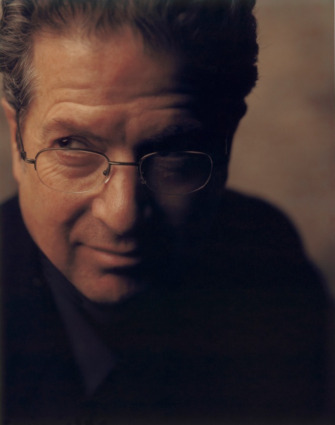 Michael Schwab: I grew up in Oklahoma, attended School of Visual Arts in NY and Art Center College of Design in Los Angeles and now work out of my studioin Marin County, California. Considering myself a graphic artist since high school, my heroes have always been sign painters, poster artists and book illustrators. I’ve always been obsessed with my work. I’m also obsessed with music, cooking, my garden, skiing, mountain biking and hunting.
Novedge: Posters are your most congenial graphic mediums; did you pick posters or posters picked you?
Michael Schwab: Early in my career I would draw anything, but I put my heart and soul into posters. Being part of the 1960’s – I was inspired by the Fillmore posters, album covers, etc. That interest led me to European poster artists such as The Beggarstaffs, Cassandra, Lucien Bernhard and Hohlwein.
Novedge: When did you know you were on the right track?
Michael Schwab: When I began winning awards in Communication Arts and Graphis for my poster designs.
Novedge: What is a recent project you have worked on ?
Michael Schwab: I’m always working on various phases of 3 or 4 projects. Currently on my drawing table is a poster project for San Francisco Opera, four Bay Club brochure covers, wine menu cover, poster sketches for a Broadway play, logo for a Wild and Scenic river in Montana.  Novedge: Your style is iconic and it's been described as "dramatic in its simplicity"; how would you describe your own style?
Michael Schwab: My style is very graphic. Simple. Bold. The best description is a German word: Plakatstil – or, poster style, popular in Europe in the 1920’s and 30’s.
Novedge: In what historical period would you have liked to live?
Michael Schwab: 1900 – 1930
Novedge: What is your relationship with Design Technology?
Michael Schwab: Long distance. There is no computer on my drawing table. My projects begin with pencil and paper, then to ink on paper, scanned, then finally to digital files ready for printing. It’s definitely cleaner than airbrush paint. The computer, in the end, works well for me, but I’m certainly not what you would call tech-savvy.
Novedge: Tell us one simple rule about Graphic Design.
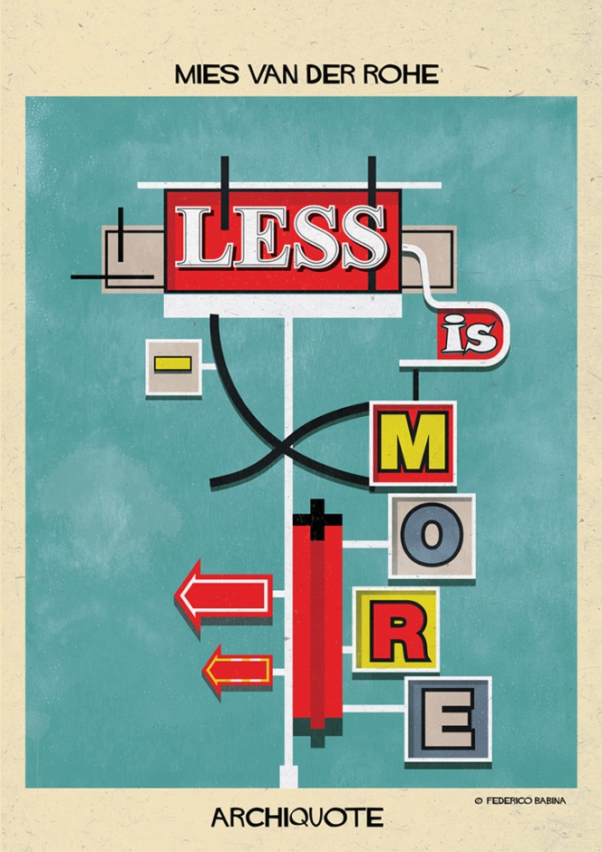
Michael Schwab: Less Is More.
Novedge: Did you ever consider another career?
Michael Schwab: No.  Michael Schwab's work speaks for itself. Check out his amazing poster catalog and try to pick your favorite Michael Schwab Poster. It's not going to be an easy task. If you have been following Novedge during our coverage of the Architecture and The City Festival in September, you will know that Micheal designed the poster symbol of the month long celebration.
A lot has been written about Michael Schwab and his work, but I would like to end this interview with a quote from Michael Schwab himself:
The basic premise of my work is this: the message must be succinct, immediate and legible from "way across the room". Michael Schwab
Mission accomplished.
Inspired to create iconic work ? I will try to be simple and succinct: Novedgeis the best place to buy Design Software online.
Related articles
Also in NOVEDGE Blog
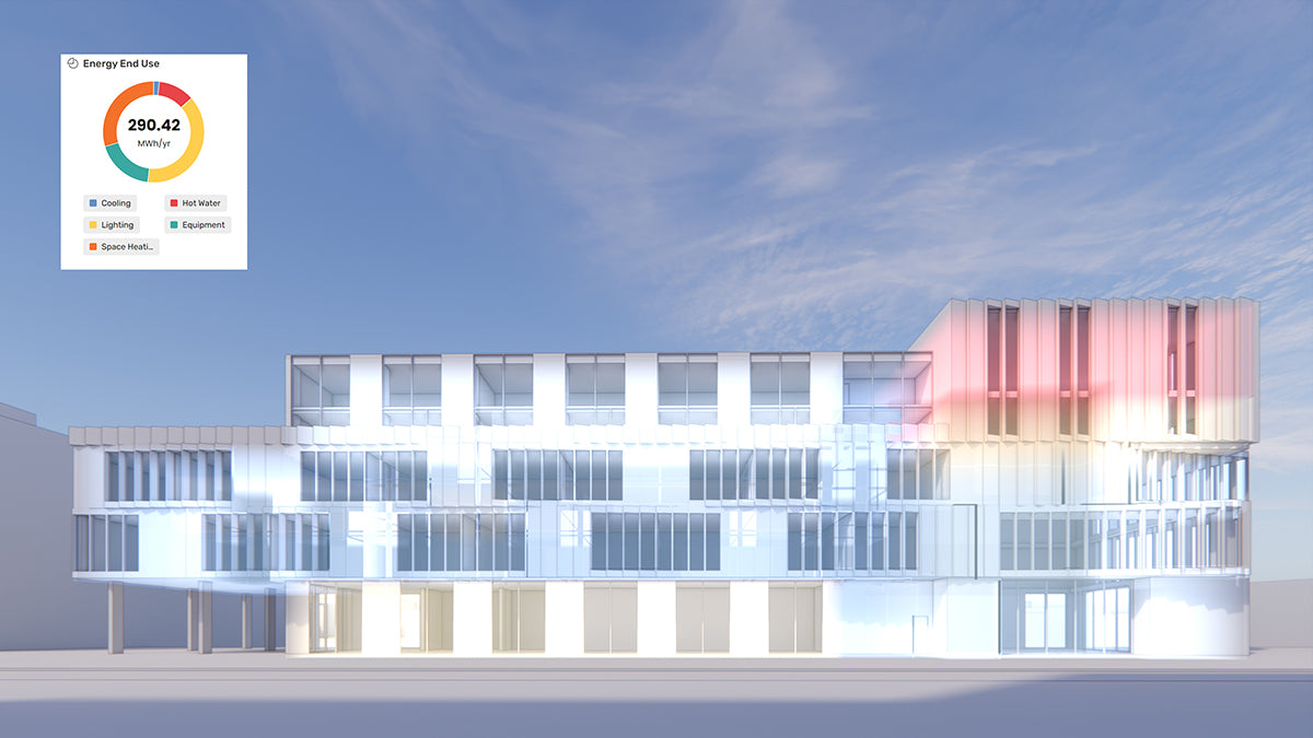
How the AEC Industry Shifted Towards Essential Sustainable Building Design
August 15, 2024 4 min read
Read More
Unlocking New Realms of Design with Enscape 4.1: Introducing Impact Add-on and Lot More
August 02, 2024 2 min read
Read More
Explore Autodesk Revit 2025.2: New Features and Enhancements for Enhanced BIM Workflows
July 30, 2024 3 min read
Read MoreSubscribe
Sign up to get the latest on sales, new releases and more …


