Your Cart is Empty
Customer Testimonials
-
"Great customer service. The folks at Novedge were super helpful in navigating a somewhat complicated order including software upgrades and serial numbers in various stages of inactivity. They were friendly and helpful throughout the process.."
Ruben Ruckmark
"Quick & very helpful. We have been using Novedge for years and are very happy with their quick service when we need to make a purchase and excellent support resolving any issues."
Will Woodson
"Scott is the best. He reminds me about subscriptions dates, guides me in the correct direction for updates. He always responds promptly to me. He is literally the reason I continue to work with Novedge and will do so in the future."
Edward Mchugh
"Calvin Lok is “the man”. After my purchase of Sketchup 2021, he called me and provided step-by-step instructions to ease me through difficulties I was having with the setup of my new software."
Mike Borzage
Novedge Pulse 2.0 is Online
May 27, 2008 3 min read

It was just a couple of weeks ago that Novedge Pulse 1.0 went online. Novedge Pulse is much more than a "blog of blogs," it’s a community-based aggregator that collects and organizes blog posts, news, tutorials, videos, product reviews, Press Releases, and much more.
Novedge Pulse is much more than a "blog of blogs," it’s a community-based aggregator…
Today I’m happy to officially announce that Novedge Pulse 2.0 is online, and brings with it with several improvements. Those who have visited Novedge Pulse recently may have noticed the changes. I deployed updated versions day by day, as new features became available. Here are the major improvements:
- The voting system went from thumbs up/down to beats/burns. I find this metaphor for expressing the vote more coherent with the concept of Pulse. Beat stands for heartbeat, and burn for heartburn. No offense to those who occasionally received some burns.
- News and blog posts are grouped by day. Pulse 2.0 changed the semantic of the default view. Now it displays the news of the last 24-28 hours instead of just the current day’s news. I realized the concept of today is difficult to define for a global audience because of time differences. This improvement guarantees the same exposure to all blog posts and news regardless of the time of the day they become available on Pulse.
- New sorting option is now available. You can choose between “Newest First” and “Best First”. If you visit Novedge Pulse more than once a day you may opt to display the latest items on the top of the page, regardless of the rating.
- Compact and detailed views are now available. A clear icon on the top toolbar lets you switch between a detailed view and a compact view. Each blog post or news can also be switched between the two views with a single click.
- When the information is available (for public companies) for a news item, Novedge Pulse displays a link to the company profile on Yahoo! Finance. This lets viewers check in one click the financial status of that specific company.
- In a similar way for each blogger, when available Pulse displays a link to his/her profile on LinkedIn. I believe this is a great improvement because it lets the reader check the affiliations and relationships of a blogger (e.g. when I read a comment about AutoCAD I would like to know if the blogger is an Autodesk employee or an Autodesk reseller).
- Pulse now has RSS feeds. That means you can read Novedge Pulse news directly in your News Reader without having to visit Novedge Pulse. At Novedge we believe in sharing our resources, and this is just one example.
- Last but not least, the entire layout and user interaction has been simplified to contain only the most essential components.
I’m the first and probably the most assiduous user of Novedge Pulse. I check Pulse regularly to see what’s going on in the Design and Graphics community and I really enjoy it as a user. The number of votes is still relatively small but is growing consistently every day. The more votes we get the more useful Novedge Pulse becomes.
I would love to get your feedback and opinions about Novedge Pulse, including how you use it and how you would like Novedge Pulse to evolve.
Franco Folini
Also in NOVEDGE Blog

How the AEC Industry Shifted Towards Essential Sustainable Building Design
August 15, 2024 4 min read
Read More
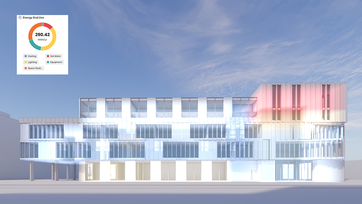
Unlocking New Realms of Design with Enscape 4.1: Introducing Impact Add-on and Lot More
August 02, 2024 2 min read
Read More
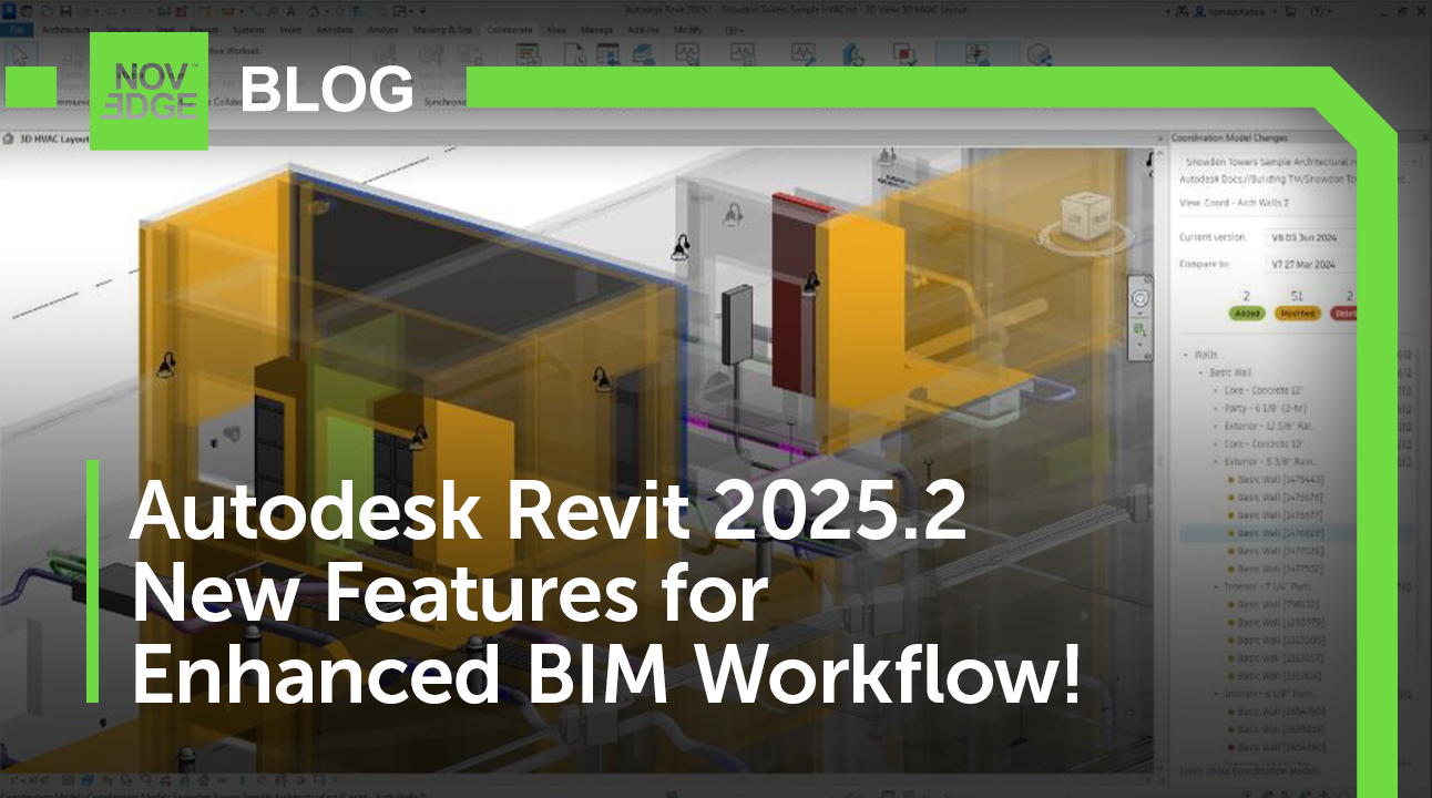
Explore Autodesk Revit 2025.2: New Features and Enhancements for Enhanced BIM Workflows
July 30, 2024 3 min read
Read MoreSubscribe
Sign up to get the latest on sales, new releases and more …


