Your Cart is Empty
Mastering Client Perception: Five Enscape Render Styles to Accelerate Design Approval
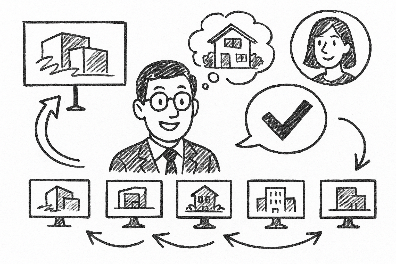


Translating a design vision into stakeholder enthusiasm often hinges on the first visual impression. The following exploration guides architects, interior designers, and visualization specialists through five Enscape render styles that consistently reshape client perception and shorten approval timelines.
Photorealistic Daylight Interior
Purpose
Nothing calms a skeptical client faster than seeing morning light pour across a dining table exactly as it will in reality. This render style fuses balanced illumination, precise texture representation, and measured depth of field so viewers instantly gauge material authenticity, lighting quality, and spatial comfort.
Core Settings & Techniques
- Calibrate an HDRI skybox with a neutral mid-morning sun to eliminate unwanted color shifts. An overcast HDRI often works best because the skylight creates soft, wraparound shadows that amplify material detail.
- Assign 4K or 8K textures to all tactile finishes. Pair each texture with normal and bump maps—oak flooring, for example, benefits from a 2 mm bump map that catches soft grazing light and clearly distinguishes plank seams.
- Dial Global Illumination to Ultra. Pair it with Ambient Brightness around 10 % lower than default to prevent blown-out whites when the camera turns toward a window.
- Add a subtle 0.3 f-stop depth of field to pull attention toward the primary furniture grouping without blurring architectural context.
Client Impact
A single still can settle endless debates over beige versus greige, polished chrome versus brushed nickel. Finish selections become tangible, and clients quickly sign off because the room already feels lived in. Revision rounds often drop from three to just one when this daylight interior is supplied early.
Professional Insights & Pitfalls
Preserve neutral white balance—pushing too warm introduces a cosmetic “Instagram filter” that can mislead users about paint undertones. Likewise, overusing depth of field can hide corner cabinet alignments that contractors later flag. A/B test the render in both cold and warm monitors before you present to reduce surprises.
Golden Hour Exterior Hero Shot
Purpose
A well-timed dusk capture wraps architecture in deep oranges and purples, creating an emotional narrative of “coming home.” The low-angle sun sculpts façade articulation, while landscape uplights twinkle on the verge of darkness, reinforcing a cinematic sequence.
Core Settings & Techniques
Move the time slider in Enscape until shadows stretch almost three times the building height—usually around 6 : 50 p.m. in midsummer latitudes. Then adjust Sun Intensity to 85 % so glazing reflections remain legible.
- Enable Lens Flares to mimic real glass ghosting when the camera is slightly pitched toward the sun. Keep intensity under 10 % to prevent distraction.
- Set Bloom at 5 % with a threshold of 0.8. This produces gentle glow on sconces and interior lights now visible through glazing.
- Apply a 0.2 vignette to gently frame the image center—this is especially effective for social-media crops where edges may be lost.
Client Impact
When investors see a hero shot worthy of a magazine cover, project prestige escalates instantly. Marketing teams can cut the image directly into brochures without extensive Photoshop, accelerating campaign timelines by weeks. The dramatic contrast also highlights façade materials—brick corbelling and metal panels read crisply under angled light, guiding confident specification approval.
Professional Insights & Pitfalls
Push color temperature downward (4 800 K) so white stucco stays white. Introduce animated grass or slow-moving pedestrians to offset the otherwise static dusk environment—15 % speed feels natural without dragging down frame rate. Resist the temptation to saturate sky magentas; overprocessing quickly crosses from cinematic to artificial.
Two-Point Perspective Architectural Animation
Purpose
Static hero images sell mood, but spatial comprehension often demands motion. Locking the camera to verticals ensures walls remain upright throughout the journey, eliminating the subconscious unease that comes from keystone distortion.
Core Settings & Techniques
Engage Two-Point Perspective before establishing any keyframes—that prevents later adjustments from snapping abruptly. Create a spline-like camera path, but insert extra keyframes at every doorway to control speed and prevent collision with frames.
- Use Bezier easing at 35 % on entry and exit of each keyframe. Viewers then feel a soft acceleration, echoing natural walking rhythm.
- Keep Motion Blur on Low. This yields crisp video stills that marketing teams can lift out as hero images while the animation remains fluid.
- Render at 30 fps minimum and 4 K resolution when possible; even if the final deliverable is 1080p, the supersampling reduces noise in glass reflections.
Client Impact
A well-paced walkthrough gives non-technical stakeholders an ergonomic benchmark—corridor widths, door swings, and ceiling heights translate into physical memory. The content is highly shareable; an MP4 under two minutes often sits on the first slide of an investment deck, serving as an immediate conversation catalyst.
Professional Insights & Pitfalls
Maintain eye-level cameras around 1.6 m; deviations create a “drones-eye” quality that can distort sense of scale. Avoid tight 90-degree turns in small rooms—geometry clipping shatters immersion faster than any other artifact. If you must navigate a switchback stair, break it into two separate clips and dissolve between them for continuity.
Real-Time VR Walkthrough
Purpose
Virtual reality pivots the conversation from “Do you like it?” to “How does it feel living here?” because occupants physically turn, kneel, and reach. This experiential layer converts abstract floor plans into muscle memory, fundamentally shortening decision cycles.
Core Settings & Techniques
To hit the 90 fps threshold that avoids nausea, strip secondary rooms of high-poly props. Replace complex pendant lighting with proxy objects that still cast accurate shadows. Enable SteamVR or Oculus runtime depending on hardware; Enscape handles both with identical material translation.
- Position interactive hotspots near difficult decisions—kitchen backsplashes, office partition materials, or lobby flooring. A quick controller tap toggles options, enabling instant feedback.
- Bake indirect lighting into lightmaps when possible; dynamic GI is powerful but can introduce subtle flicker anytime users lean near a glossy surface.
- Keep file size under 1 GB to avoid long load times during a live meeting. Compress textures and purge unused assets before exporting.
Client Impact
Teams often allocate entire workshops to VR rooms now, because the environment compels quicker consensus on furniture clearances, sightlines, and even brand graphics placement. Funding boards see excitement translate into tangible commitment—several firms report loan approvals within days when VR was part of the pitch deck.
Professional Insights & Pitfalls
Begin with teleport navigation. Continuous locomotion disorients first-time users. Have ginger candy on hand—simple yet effective for queasy guests. Finally, remember that dark carpets appear darker in VR headsets; raise the albedo a few points to maintain visual clarity.
Artistic White Mode with Sketch Overlay
Purpose
During initial concept reviews, full-color realism can overwhelm the process, shifting discourse toward finishes rather than proportion. White Mode with linework overlay rekindles the spirit of graphite on paper while still leveraging Enscape’s physically based light engine.
Core Settings & Techniques
Activate White Mode and set the base albedo to an off-white (#f7f7f7) rather than pure white to retain subtle light-bounce shading. Overlay lines at 1 px and send Jitter to 18 for hand-drawn imperfection.
- Crank Ambient Occlusion to 400 %. This highlights reveals, cornices, and sill projections so clients can read depth without color distraction.
- Add a faint watercolor LUT (Look-Up Table) in post—opacity around 15 % warms the palette just enough to soften digital sterility.
- Export in portrait orientation for printable 11 × 17 boards; the taller frame complements massing diagrams and elevation callouts placed alongside.
Client Impact
By stripping color, conversations return to fundamental geometry. Traditional decision-makers appreciate the craft echoes of a sketch, while younger stakeholders enjoy the fluid toggling to photoreal modes when needed. The blend serves as common ground, reducing friction between generational preferences.
Professional Insights & Pitfalls
Over-dark Ambient Occlusion can tip the scene into noir territory, undermining the concept’s freshness. Reserve heavy AO for industrial projects; residential and hospitality spaces benefit from lighter shadows. Finally, ensure window glass remains slightly translucent even in White Mode so daylight logic isn’t lost.
In practice, a strategic rotation of photoreal interiors, sunset exteriors, orthogonal animations, immersive VR, and stylized white studies shepherds projects from napkin sketch to marketing launch without skipping a beat. Each style targets a distinct emotional trigger—comfort, awe, clarity, immersion, or imagination—building a comprehensive narrative that turns hesitant observers into enthusiastic champions.
Save your preset files, iterate relentlessly, and annotate each client’s feedback directly inside Enscape. Over time you will cultivate a kit of rendering strategies that not only delights stakeholders but also acts as an internal checklist, compressing production while amplifying visual impact.
Also in Design News